Lincoln Posted April 6, 2015 Share Posted April 6, 2015 And I'll take these for the miss, almost entirely because of the ugly leopard print on the right sleeve. Yeah - they come across as one of those Justin Bieber'esque sleeve tattoos. Quote Link to comment Share on other sites More sharing options...
losnickes Posted April 7, 2015 Share Posted April 7, 2015 The Company... Fantastic drum corps. Notice I did not say European corps, or little drum corps or any other word that would lessen what they are... simply a fantastic drum corps. Additionally, their members and staff are some of the nicest people you'll ever meet. They are spectacular. They, along with the Kidsgrove Scouts are the reasons I look forward to the DCE webcast every year. They first time I ever make a trip to Europe, it will be to see The Company live. Quote Link to comment Share on other sites More sharing options...
Kamarag Posted April 7, 2015 Share Posted April 7, 2015 They are spectacular. They, along with the Kidsgrove Scouts are the reasons I look forward to the DCE webcast every year. They first time I ever make a trip to Europe, it will be to see The Company live. Kidsgrove Scouts are making the trip to the US for DCA this summer. They are a fantastic corps and quickly became a fan favorite when they were here a couple of years ago. Quote Link to comment Share on other sites More sharing options...
losnickes Posted April 7, 2015 Share Posted April 7, 2015 SOUHTWIND Hit: 2007. A simple, yet very clean look. Plus, not many corps wear yellow. Miss: 2005. This was a very effective look for their show that year. But still, not my favorite look for them. Next up: Racine Scouts Quote Link to comment Share on other sites More sharing options...
mellogoodcritic Posted April 7, 2015 Share Posted April 7, 2015 Back to the topic, the Mandarins were nominated. Hit: 2014 - Very nice design! Miss: 2013 - I understand they wanted it to fit with the show theme, but in my opinion it's way too much color. I understand you point, here's my thought process. The jacket on both uniforms are very attractive and well designed. The waist capes in 2013 added an extra needed pop. Without it, the top looks too busy and the bottom just looks way to plain.... their shakos are also excellent Quote Link to comment Share on other sites More sharing options...
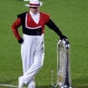
Geoff Posted April 8, 2015 Share Posted April 8, 2015 I'll play even though, admittedly, I don't know much about the uniform history of the Chrome Domes. But some googling turned up this. I dig it. And those helmets are unique. Very cool! But what happened here? I'm speculating that perhaps budget constraints led to this simple uniform. I get the need to save some money, but I'm sure we could have done better. The polo shirt with white pants, that belt, and why the newsboy style hat? Did they play the music of Newsies? (Side note... I played the music of Newsies in 1993. No one ever do that.) And the gauntlet with short sleeve thing? Why is this look popular in Wisconsin? It's hideous. Next corps: Kiwanis Kavaliers Quote Link to comment Share on other sites More sharing options...
xandandl Posted April 8, 2015 Share Posted April 8, 2015 It's one thing to dislike something even to the point of calling it "hideous." But it is a better thing to know why something doesn't work as in the explanation of the Mandarin added fabric. I propose a reason why short sleeves don't usually work as a uniform: they are not uniform. Whether by race, nationality, gene pool, or sun block, the exposed skin of different people develop different hues and breaks any sense of common pattern. The long sleeves bind the whole ensemble look, allows for mixed Race corps to stand whomever they want next to whomever they want without looking like piano keys. No slight to the marchers or disrespect to anyone but in a close-up photo, the variance is noticeable. Some, but not as much up in the box or stands. JMHO Quote Link to comment Share on other sites More sharing options...
losnickes Posted April 8, 2015 Share Posted April 8, 2015 I'll play even though, admittedly, I don't know much about the uniform history of the Chrome Domes. But some googling turned up this. I dig it. And those helmets are unique. Very cool! But what happened here? I'm speculating that perhaps budget constraints led to this simple uniform. I get the need to save some money, but I'm sure we could have done better. The polo shirt with white pants, that belt, and why the newsboy style hat? Did they play the music of Newsies? (Side note... I played the music of Newsies in 1993. No one ever do that.) And the gauntlet with short sleeve thing? Why is this look popular in Wisconsin? It's hideous. Next corps: Kiwanis Kavaliers Racine has had the same basic uniform (the first one you showed) since 1964, when they debuted their unique helmet. In 2013, they decided to use that placeholder "newsies" uniform because the old uniforms had undergone so many alterations and modernizations, a lot of the jackets didn't look the same anymore, and they were pretty beat up. In 2014, they got brand new uniforms that went straight back to the original look. In short, the newsies outfit didn't look fantastic, but it was the lesser of two evils. Quote Link to comment Share on other sites More sharing options...
MikeN Posted April 8, 2015 Share Posted April 8, 2015 Kiwanis Kavaliers - Hit - 200...5? Last uniform they had, which was a throwback to their earlier days (open BD-style jackets), and looked very, very sharp. Miss - 2002's Hall of Justice. Fit the theme, but ... yeah. Have we talked about Phantom Regiment yet? Mike Quote Link to comment Share on other sites More sharing options...
losnickes Posted April 8, 2015 Share Posted April 8, 2015 Have we talked about Phantom Regiment yet? Mike We have, but if I recall correctly, a corps can be nominated more than once. So I'll take a crack at Phantom. PHANTOM REGIMENT Hit: 2002. I'm probably in the minority, but I was really fond of this uniform. When they had the red sash, however, I didn't care for it. Miss: 2011/2012. Two great corps and two great shows, just a not so great uniform. Phantom's traditional baldric sash is gone, and I was never crazy about the black plumes with the white helmets. Next up: Since there's more than enough uniforms to choose from, let's do the CROSSMEN again. Quote Link to comment Share on other sites More sharing options...

Recommended Posts
Join the conversation
You can post now and register later. If you have an account, sign in now to post with your account.