MelloMatt Posted March 25, 2015 Share Posted March 25, 2015 (edited) Also due to lack of nomination by previous poster I'm gonna do Colts. Hit: Early 80's and Present Uniforms 80's Present Miss: 86-89 (Burger King Uniforms) Nominating Boston Edited March 25, 2015 by MelloMatt Quote Link to comment Share on other sites More sharing options...
TroopAlum12 Posted March 25, 2015 Share Posted March 25, 2015 I don't mind them. Certainly liked them more than this: This would probably be my vote for Phantom's miss. They look like bad WGI uniforms to me. 4 Quote Link to comment Share on other sites More sharing options...
MelloMatt Posted March 25, 2015 Share Posted March 25, 2015 This one's interesting. I'm not exactly the biggest Phantom fan, and I really don't like their uniforms at all right now. I feel like the obvious choice for the hit would be the mid-90s all blacks, but I'm gonna hit you with the polar opposite side of the color spectrum—the 2011 whites were some of the sharpest, nicest uniforms in DCI history. It's a shame they went to that black crest mess the next year. These beauties were from Into the Light (2010) Quote Link to comment Share on other sites More sharing options...
FuriousSoundbyte Posted March 25, 2015 Share Posted March 25, 2015 (edited) These beauties were from Into the Light (2010) Yeah, I don't know how I made that mistake. I think I was making a mental note about how Juliet (2011) was a big miss. The Red Violin all-whites in 09 were really nice too, but I've always fondly remembered that really rad side sash from Into the Light. Edited March 25, 2015 by FuriousSoundbyte 1 Quote Link to comment Share on other sites More sharing options...
Eleran Posted March 25, 2015 Share Posted March 25, 2015 Hmmm ... could use a little remedial hem-sewing on one or two left pant legs there Quote Link to comment Share on other sites More sharing options...
JAZZER Posted March 25, 2015 Share Posted March 25, 2015 11 1979 2000 gracias mello Quote Link to comment Share on other sites More sharing options...
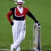
MotoSurfBass Posted March 25, 2015 Share Posted March 25, 2015 (edited) Colts. Hit: Present Am I the only one here who truly loathes these uniforms? The fade went out of style nearly a half-decade beforehand, and I personally do not like the red to purple to black coloring, compounded by the fact that the put on fade ON A LEG STRIPE TOO!!! Also, the white at the top and the color split on the plume look clunky from every direction but head-on. The Colt Cadets uniform is a much sharper looking one, and I think it would have been better on the A corps. EDIT: Also just noticed that my first Vanguard miss pic was changed for a broken link, and I must admit that the new pic is a tad more flattering for that look. The link to the page with the original image is http://www.angelfire.com/pa5/uniformicons/. My opinion still stands, too much green. Edited March 25, 2015 by MotoSurfBass 1 Quote Link to comment Share on other sites More sharing options...
Eleran Posted March 25, 2015 Share Posted March 25, 2015 Am I the only one here who truly loathes these uniforms? Maybe not "loathe", but I don't disagree with your general assessment. Quote Link to comment Share on other sites More sharing options...
TroopAlum12 Posted March 25, 2015 Share Posted March 25, 2015 The link to the page with the original image is http://www.angelfire.com/pa5/uniformicons/. My opinion still stands, too much green. Holy cow, that website is straight out of the '90s 1 Quote Link to comment Share on other sites More sharing options...
boxingfred Posted March 25, 2015 Share Posted March 25, 2015 I loved the CrossChaChos I Loved the Grey Devils I loved the over ripe Bridgemen I loved all the White Phantom unis I love when the Cadets switched to poly/cotton blend (sorry Trama hasn't worn off) I love SCV always! I love the Blue Coats 2 Quote Link to comment Share on other sites More sharing options...

Recommended Posts
Join the conversation
You can post now and register later. If you have an account, sign in now to post with your account.