Lincoln Posted June 18, 2015 Share Posted June 18, 2015 (edited) The guard skeleton costume is hilarious! Perfect for a show with Tesla coil props! Edited June 18, 2015 by Lincoln 1 Link to comment Share on other sites More sharing options...
bonelife Posted June 18, 2015 Share Posted June 18, 2015 I like Vanguard, but the white baldric and gold tassel make for a bit too much icing on an otherwise nice looking cake.I could see that with the tassel. Kind of feels crowded with it. Link to comment Share on other sites More sharing options...
Cleveland1 Posted June 18, 2015 Share Posted June 18, 2015 I like Vanguard, but the white baldric and gold tassel make for a bit too much icing on an otherwise nice looking cake. I mostly agree, but i like how it hides where the two halves of the uniform meet which i imagine might look weird. or not, idk. But they've had the tassel since their redesign in 2013 for Les Mis and kept it for last year where they added the sash. I think they like it, and feeling it and looking at it up close at finals last year at the stanbury booth, i can't blame them. But i do feel like since 2013 SCV has gone out of their way to make every inch of the uniform perfect, which can seem like overdoing it since there is a lot going on that is subtle, its more about texture than flash. Link to comment Share on other sites More sharing options...
Lincoln Posted June 18, 2015 Share Posted June 18, 2015 I mostly agree, but i like how it hides where the two halves of the uniform meet which i imagine might look weird. or not, idk. But they've had the tassel since their redesign in 2013 for Les Mis and kept it for last year where they added the sash. I think they like it, and feeling it and looking at it up close at finals last year at the stanbury booth, i can't blame them. But i do feel like since 2013 SCV has gone out of their way to make every inch of the uniform perfect, which can seem like overdoing it since there is a lot going on that is subtle, its more about texture than flash. Great points! Link to comment Share on other sites More sharing options...
Cappybara Posted June 18, 2015 Share Posted June 18, 2015 I miss the white uniforms :( 1 Link to comment Share on other sites More sharing options...
Pete Freedman Posted June 18, 2015 Share Posted June 18, 2015 1. Its a play on words because the show is the Spark of Invention. So, SCV are being very inventove this year. 2. The entire front looks very inventive in its use of the green, red, black, and white. The placement of buttons. The use of the sash. The sparkle on the black portion. It is an inventive uniform and one that is "vanguard" in every sense of the word. Yes, I was referring to the way the guard uniform (in the first pic) in particular complements the show idea. The angular shapes and energetic colors convey mechanical movement without using more explicit machine shapes like gears. Link to comment Share on other sites More sharing options...
Cleveland1 Posted June 18, 2015 Share Posted June 18, 2015 Yes, I was referring to the way the guard uniform (in the first pic) in particular complements the show idea. The angular shapes and energetic colors convey mechanical movement without using more explicit machine shapes like gears. Ah, that too! My favorite part of the uniforms for the non-guard is probably how they are clearly victorian era inspired uniforms without just being straight up victorian garb. I think that is mostly thanks to the sash and tassels. And they are pulling it off without seeming steampunkish. Link to comment Share on other sites More sharing options...
DrumManTx Posted June 18, 2015 Share Posted June 18, 2015 I REALLY like Vanguards look, a lot. 3 Link to comment Share on other sites More sharing options...
Brutus Posted June 18, 2015 Share Posted June 18, 2015 What you are not seeing in this picture is the back of the jacket. It is also solid dark green a continuation of the shoulder color. The jacket has 2 dark green tails like a tuxedo jacket with red lining. Look closely at the right leg of the trumpet and snare drummer. You will see the edge of the tail. If you have to sqiunt to see whether or not it's a skirt, the audience will do the same. Link to comment Share on other sites More sharing options...
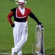
Brutus Posted June 18, 2015 Share Posted June 18, 2015 https://s-media-cache-ak0.pinimg.com/236x/20/51/2f/20512ff358a7dc6cd6b64f9624220a90.jpg 1 Link to comment Share on other sites More sharing options...

Recommended Posts