StarOrg Posted April 13, 2015 Share Posted April 13, 2015 The look is fine.. just we don't need more "blue" corps. Quote Link to comment Share on other sites More sharing options...
crownisking Posted April 13, 2015 Share Posted April 13, 2015 I don't have a problem with the design at all but I don't love the new colors. I really loved the different shades of green and (as horrible as it sounds) it was usually the only thing keeping me interested in watching them. We already have enough blue corps. This is an overall disappointment IMO. Quote Link to comment Share on other sites More sharing options...
MikeN Posted April 13, 2015 Share Posted April 13, 2015 (edited) I like it. Like BK, it makes me think of snowy mountains, water, etc. Not bad for a corps named after a mountain range. I really, *really* disliked their previous jackets - the fade didn't work and the design stretched the look of the MM's horizontally, so this to me looks like a massive upgrade for their on-field presence. I don't like the hats (thanks, FJM), but I haven't liked them on any corps I've seen them on yet. Overall, I think it's an upgrade, and ... hooray for more white pants! We're brightening up the field, one corps at a time. Cesario has said, and I wholeheartedly agree, that one of the major visual differences between marching band and DCI is that corps, by virtue of being independent ensembles, have a vested interest in a "color" identity. Witness the pushback to the 2010 Cavaliers jackets when the corps felt that the new design had too much black, corrected in 2014. So, good for Cascades not going with the camoflaged look on the field (black / green) and picking some bold, bright colors to represent them. Mike Edited April 13, 2015 by MikeN 1 Quote Link to comment Share on other sites More sharing options...
StarOrg Posted April 13, 2015 Share Posted April 13, 2015 Not sure where we left off so I posting Dutch Boy. Dutch Boy 1983. For most of the 80's they wore this uniform.. not bad. Gave them an identity. Dutch Boy 1988. New look. I didn't like this one much. A miss in my opinion. Dutch Boy 1990. Another new look. I like this one. I thought the all white jackets were sharp. Quote Link to comment Share on other sites More sharing options...
DrumManTx Posted April 13, 2015 Share Posted April 13, 2015 (edited) I do give them props for having the cajones to go with white pants. They must feel pretty confident to go that route. Are Madison and BK the only other corps last year that had White in world class? It wouldn't surprise me to see Phantom go back, and Cadets cream don't exactly hide things either (that's because they don't have anything to hide considering how clean they are visually). Maybe I like these more than I initially thought. We'll see I guess this summer. Loved Bostons up close when they were released last year and wasn't a big fan from up top. Who knows. Maybe I'll love them from up high. Speaking of Blue Knights similarities, looks like they took BKs 2013 glitter ball (I'm kidding) and gave it a pretty fantastic make over for their show: Edited April 13, 2015 by DrumManTx Quote Link to comment Share on other sites More sharing options...
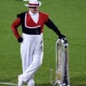
Lincoln Posted April 13, 2015 Share Posted April 13, 2015 I do give them props for having the cajones to go with white pants. They must feel pretty confident to go that route. Is BK the only other corps last year that had White in world class? It wouldn't surprise me to see Phantom go back, and Cadets cream don't exactly hide things either (that's because they don't have anything to hide considering how clean they are visually). Madison Scouts 1 Quote Link to comment Share on other sites More sharing options...
DrumManTx Posted April 13, 2015 Share Posted April 13, 2015 (edited) Madison Scouts Ahh yes, I knew I was missing someone. FYI, this pic makes me like it more for some reason. If they do the blue to black fade like that, could look pretty cool. Almost reminds me of Blue Stars 2008 - 2009 uniforms, which I loved. Edited April 13, 2015 by DrumManTx Quote Link to comment Share on other sites More sharing options...
MikeN Posted April 13, 2015 Share Posted April 13, 2015 Ah, from that graphic, looks like they're also going to have Carolina Crown's 2010-2012 shoulder caps? I know Genesis uses those too - does that mean the sleeves are an undershirt? Mike Quote Link to comment Share on other sites More sharing options...
MikeN Posted April 13, 2015 Share Posted April 13, 2015 Dutch Boy 1990. Another new look. I like this one. I thought the all white jackets were sharp. That was my favorite Dutch Boy look, by far. Mike Quote Link to comment Share on other sites More sharing options...
xandandl Posted April 13, 2015 Share Posted April 13, 2015 (edited) I don't have a problem with the design at all but I don't love the new colors. I really loved the different shades of green and (as horrible as it sounds) it was usually the only thing keeping me interested in watching them. We already have enough blue corps. This is an overall disappointment IMO. If one were to replace the blue with gold, I get the impression very similar to the Carolina Crown uniform with the cream jacket and pants and pull through thingey from a few seasons back. Make the Cascades '15 shako black, and I again see Carolina Crown and what was worn on the head for '13 and '14. And (Albert) Lo and Behold, who is the uniform designer for all of these? One Michael Cesario...(cf. graphic in post 207 above.) I guess a Cesario design gets the Cascades a few notches up the ladder which Cesario holds the final say...even to what Judges do championships. Edited April 13, 2015 by xandandl Quote Link to comment Share on other sites More sharing options...

Recommended Posts
Join the conversation
You can post now and register later. If you have an account, sign in now to post with your account.