Cappybara Posted June 16, 2017 Share Posted June 16, 2017 (edited) 1 hour ago, LabMaster said: I'm betting that if the Aussie hat was not there, you wouldn't have known it was Crossmen. What in this uniform/costume was their identifiable template? Curious to know not being snarky. Take a look at their uniforms from the past couple years. In this years' uniform, the silver part is the customizable party. It gets switched out with a different color every year Edited June 16, 2017 by Cappybara Quote Link to comment Share on other sites More sharing options...
Cainan Posted June 16, 2017 Share Posted June 16, 2017 (edited) 5 hours ago, Cappybara said: You can only recognize Crown because you're used to the uniform now. In 2013, you would've been saying "what the hell what corps is this?" I dont actually dislike the Boston costumes, in fact, I quite like it... just not on the Boston Crusaders. My biggest issue with the BAC look is that it simply does not look AT ALL like the Boston Crusaders. The color palette is gone. The Bones costumes, to me at least, still look like Bones. Phantom Regiment... even though it is significantly different than past years, still retains the color palette, the helmets and the chevrons which still say Phantom. The Academy has started to carve themselves a niche that with such accessible shows allows them to be a bit more off the wall visually but there is still no doubting who you are watching. The Boston costumes... Looks like the design staff simply opened up the Band Shoppe catalogue, tore out all the pages, taped them to a wall and then blindly threw a dart at the wall and simply went with that look. Poor. Edited June 16, 2017 by Cainan 6 Quote Link to comment Share on other sites More sharing options...
LabMaster Posted June 16, 2017 Share Posted June 16, 2017 1 minute ago, Cappybara said: Take a look at their uniforms from the past couple years. In this years' uniform, the silver part is the customizable party. It gets switched out with a different color every year Thanks. I'll check it out. Honestly hadn't look that closely in recent years. Quote Link to comment Share on other sites More sharing options...
LabMaster Posted June 16, 2017 Share Posted June 16, 2017 2 minutes ago, Cainan said: I dont actually dislike the Boston costumes, in fact, I quite like it... just not on the Boston Crusaders. My biggest issue with the BAC look is that it simply does not look AT ALL like the Boston Crusaders. The color palette is gone. The Bones costumes, to me at least, still look like Bones. Phantom Regiment... even though it is significantly different than past years, still retains the color palette, the helmets and the chevrons which still say Phantom. The Academy has started to carve themselves a niche that with such accessible shows allows them to be a bit more off the wall visually but there is still no doubting who you are watching. The Boston costumes... Looks like the design staff simply opened up the Band Shoppe catalogue, tore out all the pages, taped them to a wall and then blindly threw a dart at the wall and simply went with that look. Poor. I believe the intent of the Boston costume is to be visually aligned and congruent with the musical design. A show portraying Salem/Puritan witch trials/Hunts would not be as visually compatible with Cadet military style unis. Plus the body movement corps are now expected to include would be limited with cadet style unis. I love Boston cadet unis but what they are attempting, full program coordination, makes sense. Relying on the guard alone o be the only visual element of a program that speaks to the theme of a program is not maxing out a cohesive design. IMO 1 Quote Link to comment Share on other sites More sharing options...
Liahona Posted June 16, 2017 Share Posted June 16, 2017 8 minutes ago, Cainan said: The Boston costumes... Looks like the design staff simply opened up the Band Shoppe catalogue, tore out all the pages, taped them to a wall and then blindly threw a dart at the wall and simply went with that look. Poor. Well...the members LOVE them...so that's all that matters to me...this coming from a alum that donned the red and black... 1 Quote Link to comment Share on other sites More sharing options...
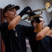
Mac13 Posted June 16, 2017 Share Posted June 16, 2017 (edited) 13 hours ago, MWilliams said: The white maltese cross on the aussie didn't give you a clue? seriously Now that you've pointed it out and I'm on my desktop computer yes you are correct that would have given me a clue. However I did not notice that last night viewing on my tiny phone screen because of the bright glare in the picture. seriously Additionally, the cross is so tiny and blends in with the aussie it makes me wonder why they even bothered. I much prefer it on the chest. There's no way anybody will be able to see it from the stands if I couldn't even see it close up on an iPhone. Edited June 16, 2017 by Mac13 Quote Link to comment Share on other sites More sharing options...
Cappybara Posted June 16, 2017 Share Posted June 16, 2017 9 minutes ago, LabMaster said: I believe the intent of the Boston costume is to be visually aligned and congruent with the musical design. A show portraying Salem/Puritan witch trials/Hunts would not be as visually compatible with Cadet military style unis. Plus the body movement corps are now expected to include would be limited with cadet style unis. I love Boston cadet unis but what they are attempting, full program coordination, makes sense. Relying on the guard alone o be the only visual element of a program that speaks to the theme of a program is not maxing out a cohesive design. IMO I agree with you, but I just think it could've been done without completely abandoning Boston's colors 1 Quote Link to comment Share on other sites More sharing options...
Mac13 Posted June 16, 2017 Share Posted June 16, 2017 (edited) I normally don't buy into pre-season hype, but several have seen Crown's new unis at recent rehearsals and say it is the best one they've had in years. They'll probably reveal this Sunday evening since that is their preview show. Edited June 16, 2017 by Mac13 Quote Link to comment Share on other sites More sharing options...
84BDsop Posted June 16, 2017 Share Posted June 16, 2017 26 minutes ago, Cappybara said: I agree with you, but I just think it could've been done without completely abandoning Boston's colors Shall I mention 88-89 BD?? Something we ALL miss in this kind of discussion is the impact of the uni NOT on the show, but on the PERFORMER. If you feel, via what you're wearing, a connection to the show concept, you're more likely to be more invested in projecting that to the audience and judges...more so than normal, I'd guess. BD '16 might be a good example...the vaguely Shakespearean uni touches won't be seen from the stands, but they'll be felt by the members. There are other touches like that...Cadets' sashes last year, Regiment's sashes and gauntlets in 07....look around and you can see it. This has been a thing for the guard and winter drum lines for years and years....the rest of the corps is simply catching up 1 Quote Link to comment Share on other sites More sharing options...
Cappybara Posted June 16, 2017 Share Posted June 16, 2017 3 minutes ago, 84BDsop said: Shall I mention 88-89 BD?? Something we ALL miss in this kind of discussion is the impact of the uni NOT on the show, but on the PERFORMER. If you feel, via what you're wearing, a connection to the show concept, you're more likely to be more invested in projecting that to the audience and judges...more so than normal, I'd guess. BD '16 might be a good example...the vaguely Shakespearean uni touches won't be seen from the stands, but they'll be felt by the members. There are other touches like that...Cadets' sashes last year, Regiment's sashes and gauntlets in 07....look around and you can see it. This has been a thing for the guard and winter drum lines for years and years....the rest of the corps is simply catching up I don't think you understand my point. I'm not opposed to changes in uniform. And I know changes in uniform have been a thing for a while. While I don't enjoy the aesthetics of Crossmen's uniform, I'm still okay with them because they still look like the Crossmen. Whether it be the colors they use or certain characteristics (the Aussie for the crossmen), there's still traces of what corps you're looking at. I thought BD's 2016 uniforms were great. They had, like you mentioned, the Shakespearean elements but they still looked like the Blue Devils. There was no confusion there. Boston's uniforms, for me atleast, are not very palatable because they pretty much throw away every trace of what corps I'm looking at. Quote Link to comment Share on other sites More sharing options...

Recommended Posts
Join the conversation
You can post now and register later. If you have an account, sign in now to post with your account.