seen-it-all Posted March 31, 2015 Share Posted March 31, 2015 it all depends on your POV and when you started. Bayonne for instance...in less than a 10 year period they went from satin blouses to cadet-style jackets to the banana uns. But nobody disputes what their legacy and identity is when it comes to uniforms. Cadet-style jackets and satin blouses were a dime a dozen in those days. As I'm sure you would agree, what they did in 1976 with the now iconic long yellow jackets altered the entire landscape of drum corps uniforms design. Star of Indiana only had nine years with which to establish some kind of visual identity, which I think gave them more freedom to change things up because they were never really bound to one distinct look. SkyRyders were another corps who never really stuck with anything long enough to leave an indelible footprint on people, and considering their programming choices, that made sense as well. They were better able to alter their designs to fit whatever their show was long before it became en vogue to do so. Quote Link to comment Share on other sites More sharing options...
MikeD Posted March 31, 2015 Share Posted March 31, 2015 But nobody disputes what their legacy and identity is when it comes to uniforms. Cadet-style jackets and satin blouses were a dime a dozen in those days. As I'm sure you would agree, what they did in 1976 with the now iconic long yellow jackets altered the entire landscape of drum corps uniforms design. I was only respoding to this: "You think of other corps of that era... SCV, Devs, Phantom, Garfield, Cavies, Freelancers, Suncoast Sound, 27, Bridgemen, Troopers, Star of Indiana (good lord how many of that list is now folded)... they all had instantly describable looks," One they donned the yellow banana unis, you are absolutely correct, esp in hindsight. I do recall all sorts of complaints about them "not being drum corps" in 1976, by the way. Quote Link to comment Share on other sites More sharing options...
Cainan Posted March 31, 2015 Author Share Posted March 31, 2015 (edited) Anyways... I believe we are now on Magic... The Hit... For me this is an absolute dead heat between 1990 and 1994: The Miss? Probably their most "professional" look (and also tame and boring....) Next up... BLUE STARS Edited March 31, 2015 by Cainan 1 Quote Link to comment Share on other sites More sharing options...
TroopAlum12 Posted March 31, 2015 Share Posted March 31, 2015 The Blue Stars! Hit: 2011 era I really liked this look. Very modern, very good colors. Looked great on and off the field. The miss: 2014. For two reasons: First: those blue jumpsuits just didn't do it for me. Second: The red plumes with the uniform also didn't work for me. I thought it clashed really bad. (feel free to disagree) Next victim: The Cadets + Quote Link to comment Share on other sites More sharing options...
Arrowmarcher Posted March 31, 2015 Share Posted March 31, 2015 The Blue Stars! Hit: 2011 era I really liked this look. Very modern, very good colors. Looked great on and off the field. The miss: 2014. For two reasons: First: those blue jumpsuits just didn't do it for me. Second: The red plumes with the uniform also didn't work for me. I thought it clashed really bad. (feel free to disagree) Next victim: The Cadets + I was actually thinking the opposite on this one. The grey uniform didn't really "pop" from the box (especially on grass), while the 2014 uniform stood out a bit more, plus it added more blue back into the look. Personally loved the red plume and I hope they continue to use them going forward. My vote for the miss was the 2007 look. Good idea in concept, but going from the iconic cross buckle to the split pants was a bit radical for me. 1 Quote Link to comment Share on other sites More sharing options...
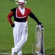
Cainan Posted March 31, 2015 Author Share Posted March 31, 2015 I agree... the grey for me was very meh... The red plumes... LOVE THEM. In case you weren't aware, Blue stars historically have worn red plumes: It's only since 2007 that they went away from them. 1 Quote Link to comment Share on other sites More sharing options...
xandandl Posted March 31, 2015 Share Posted March 31, 2015 I agree with Arrowmarcher on many points and disagree totally with Troop 12. "The grey uniform didn't ... "pop" TO the box (especially against the grass), while the 2014 uniform stood out .. more.... Personally loved the red plume and I hope they continue to use them going forward." The grey uniforms were too generic reminding me of too many BOA Indiana/Michigan units rather than the drum corps which placed second at the first DCI's. The 2014 uniform paid tribute to that legacy by returning to the corps traditional color scheme. This was most obvious when the corps and alumni corps donned the field together in LaCrosse for the Midwest Regional show. 1 Quote Link to comment Share on other sites More sharing options...
xandandl Posted March 31, 2015 Share Posted March 31, 2015 (edited) Next victim: The Cadets + Well not too many choices here. 1934 original uniform with overseas cap and cape until 1939. 1939 until 1958. maroon jacket, cream pants (with stripe), gold cummerbund, white crossbelt and white plume, shako. 1958-1959 (as uniforms had been sold to St. Mary's Cardinals, Beverly, Mass. corps.) white shirt, aussie hat and feather, shorts, 1960- return of the 1939 uniform used until 2005 with only minor tweeks (type of silver buckle, length of side sash, width of cummerbund, height of plume.) 2005-2006 the bad dream (which went with the show theme.) 2007 return of the 1939 uniform 2011 traditional color guard captain's uniform used for the Angels, Demons don maroon pants with traditional top, maroon shoes, sox and plume. Stripe takes retirement package. 2012 to present traditional uniform is back sans stripe. next up the photos posted by a tech savvy person of great elan. Edited March 31, 2015 by xandandl Quote Link to comment Share on other sites More sharing options...
Cadevilina Crown Posted March 31, 2015 Share Posted March 31, 2015 Well not too many choices here. 1934 original uniform with overseas cap and cape until 1939. 1939 until 1958. maroon jacket, cream pants (with stripe), gold cummerbund, white crossbelt and white plume, shako. 1958-1959 (as uniforms had been sold to St. Mary's Cardinals, Beverly, Mass. corps.) white shirt, aussie hat and feather, shorts, 1960- return of the 1939 uniform used until 2005 with only minor tweeks (type of silver buckle, length of side sash, width of cummerbund, height of plume.) 2005-2006 the bad dream (which went with the show theme.) 2007 return of the 1939 uniform 2011 traditional color guard captain's uniform used for the Angels, Demons don maroon pants with traditional top, maroon shoes, sox and plume. Stripe takes retirement package. 2012 to present traditional uniform is back sans stripe. next up the photos posted by a tech savvy person of great elan. Don't forget 2013 (return to the 1939 uniform, but without the iconic maroon stripe down the trousers) and 2014 (the constantly color-changing cummerbunds). Quote Link to comment Share on other sites More sharing options...
IllianaLancerContra Posted March 31, 2015 Share Posted March 31, 2015 (edited) I agree... the grey for me was very meh... The red plumes... LOVE THEM. In case you weren't aware, Blue stars historically have worn red plumes: It's only since 2007 that they went away from them. For me, this is what Blue Stars are supposed to look like - not just red plumes, but helmets. Now they are just another corps with blue uniforms and shakos - like Blue Knights, Spirit, Blue Devils, 7th Regiment, City Sound, Raiders. Edited April 1, 2015 by IllianaLancerContra Quote Link to comment Share on other sites More sharing options...

Recommended Posts
Join the conversation
You can post now and register later. If you have an account, sign in now to post with your account.