jmc5682 Posted June 12, 2015 Share Posted June 12, 2015 I am not thrilled with Crossmen's new uniforms at the moment, but if they make sense with the show perhaps they will grow on me. It is just such a huge change. I guess I am just a bit shocked is all. Link to comment Share on other sites More sharing options...
soccerguy315 Posted June 12, 2015 Share Posted June 12, 2015 I think the Crossmen uniform goes really well with the show theme. But it doesn't scream "Crossmen" It is unfortunate that many corps are losing their visual identity, IMO. 2 Link to comment Share on other sites More sharing options...
FTNK Posted June 12, 2015 Share Posted June 12, 2015 The digital printed uniforms rarely look good Link to comment Share on other sites More sharing options...
Musicman1084 Posted June 12, 2015 Share Posted June 12, 2015 Uhh....what? Love it. Still easily identifiable as Crossmen to me, but keeping with the theme. Not sure why people are being so negative about the "change" given that it's not permanent. It's clear that they are just swapping out the overlays, gauntlets and trimmings. The uniform is exactly the same as last year otherwise. Did people feel so strongly about last year's when they were sporting the Crossmen red? Link to comment Share on other sites More sharing options...
Anstig Posted June 12, 2015 Share Posted June 12, 2015 Space cowboys 1 Link to comment Share on other sites More sharing options...
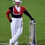
DrumManTx Posted June 12, 2015 Share Posted June 12, 2015 (edited) First impression was bad. Looking at them again, exactly the same as last year, just different panels. I think it's still Crossmen. Maltese Cross and an Aussie? Sounds like Bones to me. Not crazy about the extra colors, but it fits the theme pretty well. Think I will like the guard more from up top. Like the color scheme? But it's tucked and draped in a weird way. Drums aren't bad. I dunno, not my favorite. But it definitely works. Edited June 12, 2015 by DrumManTx Link to comment Share on other sites More sharing options...
Liahona Posted June 12, 2015 Share Posted June 12, 2015 But it doesn't scream "Crossmen" this Link to comment Share on other sites More sharing options...
ShouldveMarchedAgeOut Posted June 12, 2015 Share Posted June 12, 2015 Dig Crossmen's unis. Seems like it will fit the show well. Who cares if it isn't "Crossmen" 3 Link to comment Share on other sites More sharing options...
littlejaw Posted June 12, 2015 Share Posted June 12, 2015 Definitely look bad imo, but at least not as bad as their drum wraps. 1 Link to comment Share on other sites More sharing options...
bonelife Posted June 12, 2015 Share Posted June 12, 2015 (edited) Honestly my only problem with crossmen has to be those horizontal bar (stripe?) thingies. I think a solid blue panel would look great and suit the show fine. These look a little like Tron. Also looks like the drum major uni is the same as the normal member ones. I like 'em nonetheless. Go Bones! Edited June 12, 2015 by bonelife Link to comment Share on other sites More sharing options...

Recommended Posts