Kamarag Posted June 12, 2015 Share Posted June 12, 2015 But sufice it to say, you produce work like that in an ad agency and you won't be employeed for long. I think the design bar for uniform companies is much, much lower. Unless, of course, it's what the client asked for and fits in with the theme of what they are trying to accomplish. Good designers are flexible, and realize there are many, many types of "good design". We don't know if Crossmen's design is good or not yet, because very few people have seen them on the field in action. For all anyone here knows, they may be absolutely glorious. 2 Link to comment Share on other sites More sharing options...
MikeN Posted June 12, 2015 Share Posted June 12, 2015 In all seriousness, you're right - the bar is lower. It's whatever you can produce that clients would buy. As an armchair uniform fan and wannabe designer, though, what is it about the panel that doesn't work for you? The colors or the faux padded part? My only beef with the colors is a comment a designer made to me about our company's logo once - if you have primary colors, the only thing that really works with them is other primary colors. But in this case, they're more "laser" like stripes... Mike Link to comment Share on other sites More sharing options...
Lincoln Posted June 12, 2015 Share Posted June 12, 2015 (edited) too funny. Edited June 12, 2015 by Lincoln Link to comment Share on other sites More sharing options...
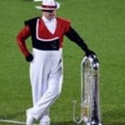
DrumManTx Posted June 12, 2015 Share Posted June 12, 2015 After seeing some pics on Facebook under the stadium lights I kinda like em..........I think like others said, these will work in context. They're not made to be looked at up close, they're made to look good from the stands and ultimately the box. And I don't understand the they don't look like the Crossmen comments. The only difference from last year is the colors. You still have the Maltese cross and you still have the Aussies. I dunno. Uniform is honestly at the bottom of my priorities while watching the show. Based on what I've seen from them so far the Uniform will be the last thing on my mind. Link to comment Share on other sites More sharing options...
drummer5485 Posted June 12, 2015 Share Posted June 12, 2015 It's not against new ideas, it's against poor execution. If I presented this design at work, I'd be freakin' fired. A good designer knows when to stop, and well, there was no stopping this designer. You can aid the theme of the show without going overboard on the uniform. Plain and simple, this is bad and amateur design. I'm not going to go into all the ins and outs of why, but if you showed this to any designer worth their salt, they would not give you a very positive opinion of things. I swear to God, this new crop of DCI costume design is so bad, I'm tempted to start a new company. I'm only half kidding. You're right, what was Cesario thinking. He's such an amateur and has never been successful in his designing career. How dare he. 3 Link to comment Share on other sites More sharing options...
dsefton Posted June 12, 2015 Share Posted June 12, 2015 After seeing some pics on Facebook under the stadium lights I kinda like em..........I think like others said, these will work in context. They're not made to be looked at up close, they're made to look good from the stands and ultimately the box. And I don't understand the they don't look like the Crossmen comments. The only difference from last year is the colors. You still have the Maltese cross and you still have the Aussies. I dunno. Uniform is honestly at the bottom of my priorities while watching the show. Based on what I've seen from them so far the Uniform will be the last thing on my mind. I agree, I saw a facebook action picture first thing this morning and thought - wow those will be cool from the stands when the lights or sun hit. I bet the members are really excited - best of luck to them! Link to comment Share on other sites More sharing options...
gak27 Posted June 12, 2015 Share Posted June 12, 2015 I knew that color scheme reminded me of something 1 Link to comment Share on other sites More sharing options...
skevinp Posted June 12, 2015 Share Posted June 12, 2015 I really dislike it when everything on this forum is generalized. Everything? That seems like a bit of a generalization. 1 Link to comment Share on other sites More sharing options...
Lincoln Posted June 12, 2015 Share Posted June 12, 2015 (edited) Everything? That seems like a bit of a generalization. Absolutely the funniest thing I've read on here in 12 years... Edited June 12, 2015 by Lincoln Link to comment Share on other sites More sharing options...
GUARDLING Posted June 12, 2015 Share Posted June 12, 2015 (edited) Unless, of course, it's what the client asked for and fits in with the theme of what they are trying to accomplish. Good designers are flexible, and realize there are many, many types of "good design". We don't know if Crossmen's design is good or not yet, because very few people have seen them on the field in action. For all anyone here knows, they may be absolutely glorious. Im very sure they will just glow under the lights. Lets face it BD has had some pretty stinky guard uniform designs from scott who has been one of the most talented in the business over the years ( and still is I might add ) BUT they did work for the design and theme.Even the FJM team raised their eyebrows a few times . Sal Salas is know for tacky uniforms also, did they work? most of the times sure, did they fit a theme? yes ,could they have been more tasteful? sure, although taste is a very subjective thing. Im very sure Crossmen knew just leaving the red and black out would cause a stir but yet took a design risk for whatever reason which will be soon revealed. I say good for them. They are the Pride colors and Crossmen are a proud drum corps so maybe that's it .lol..Isn't june Pride month? Just kidding of course. In any event I bet it just glows and lights up the field Edited June 12, 2015 by GUARDLING 3 Link to comment Share on other sites More sharing options...

Recommended Posts